How to Edit Markdown on iPad with Split View
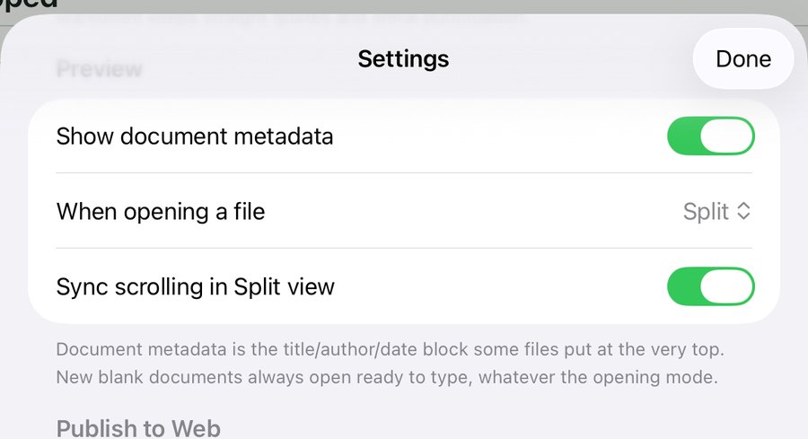
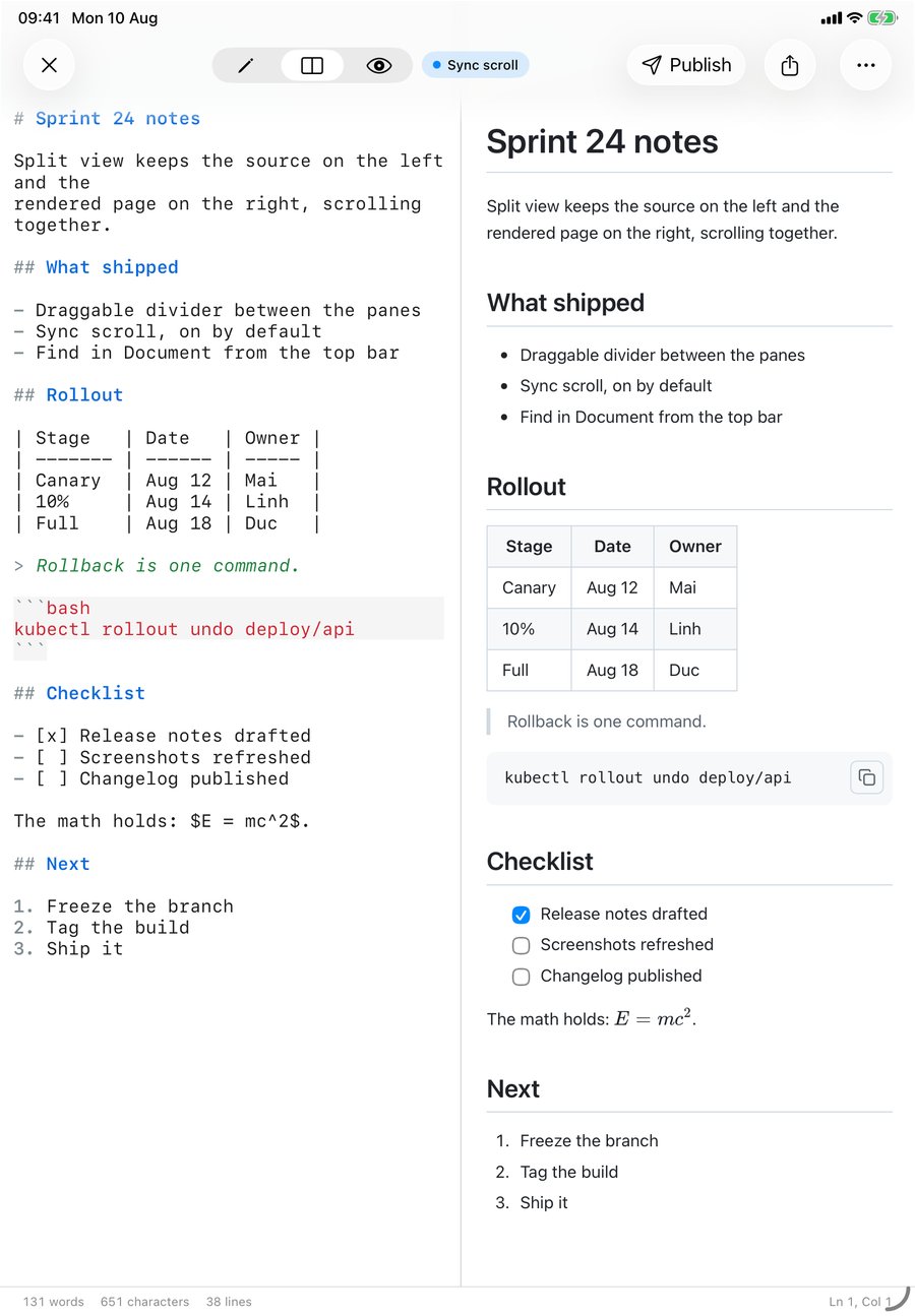
To edit Markdown side by side on an iPad, open the file in QuickMark and tap the middle icon in the segmented control at the top of the screen. The source goes on the left, the rendered page on the right, and the two scroll together. That is the whole setup. If you want every file to open that way, set Settings ▸ Preview ▸ When opening a file to Split once and forget about it.
First, two different things are called "split view"
iPadOS has its own Split View, the multitasking one, where two separate apps share the screen. QuickMark works there: it does not opt out of iPadOS multitasking, so you can park it next to Safari or Mail and drag text across.
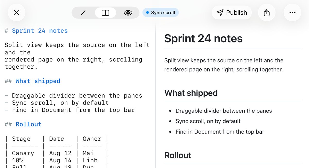
This post is about the other one. QuickMark's split view lives inside the app and splits one document into two panes: your Markdown on the left, the live preview on the right. The rest of this article means that one.
Turning it on
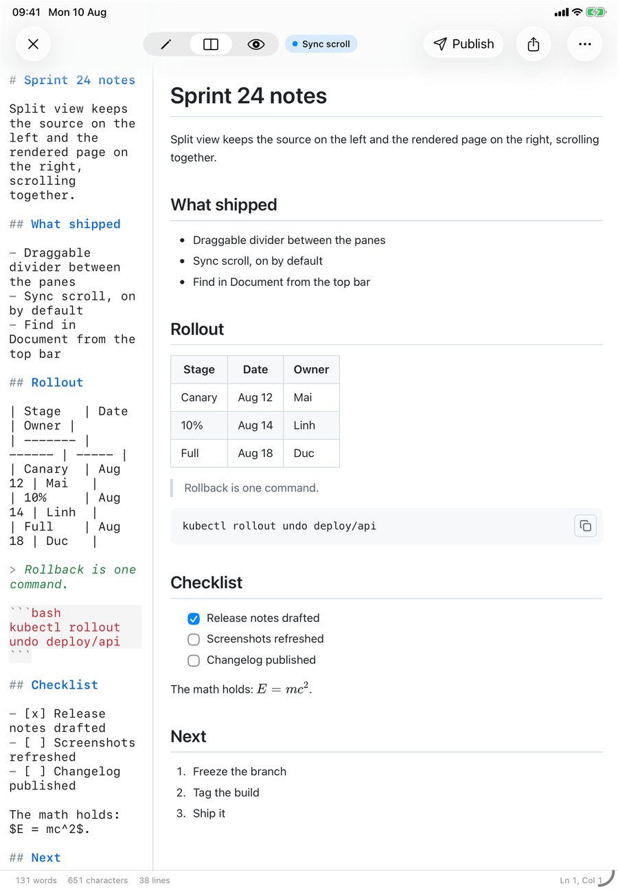
The mode picker sits in the middle of the top bar and has three states: pencil (editor only), the two-rectangle icon (split), and the eye (preview only). Tap the middle one.
Split is iPad-only. On iPhone there is no room for two useful columns, so the app toggles between editor and preview instead, and a saved preference of "Split" quietly falls back to preview on that device. If you mostly read on the phone and write on the tablet, that is exactly the behaviour you want.
Two defaults worth knowing:
- A brand-new blank document always opens ready to type. On iPad that means split, whatever your preference says, so you can write and watch the render at the same time from the first keystroke.
- An existing file honours Settings ▸ Preview ▸ When opening a file, which offers Preview, Editor and, on iPad only, Split.
The divider moves, and it has a floor
The line between the panes is draggable. Put a finger on it and slide: the split is stored as a ratio, not a fixed number of points, so rotating the iPad or resizing the window keeps your proportions instead of snapping back to half and half.
It will not let you crush a pane to nothing. Each side stops at 200 points. I dragged the divider as far left as it would go on an 11-inch iPad in portrait and then measured where the line actually landed in the screenshot: 202.5 points from the left edge, which is the 200-point minimum plus the divider sitting in the middle of its own 6-point grab strip. Exactly what the code says, and a good thing too. A two-point-wide editor would be a great way to lose your place.
Sync scroll, and what it actually syncs
Next to the mode picker, only in split, there is a Sync scroll chip. It is on by default. It disappears in editor-only and preview-only mode, because there is nothing to sync.
What happens underneath is worth a paragraph, because "synced scrolling" means different things in different apps. QuickMark maps positions by source line, not by percentage of the document. The editor reports a fractional line number as you scroll, the renderer tags every block it emits with the line it came from, and the preview interpolates between blocks. That is why a long table or a big code fence does not throw the two panes out of alignment the way a naive percentage scroll does.
It works in both directions:
- Scroll the editor and the preview follows. While it is following, the preview's own scroll indicator is hidden and comes back about a third of a second after you stop, so you do not get a flickering bar on the pane you are not touching.
- Scroll the preview and the editor follows. The app then ignores editor scroll reports for a quarter of a second, which is the loop-breaker: without it the follower would push the leader back and the two panes would fight each other.
Turn the chip off and the panes scroll independently. Turn it back on and the preview jumps to wherever the editor is currently sitting, rather than waiting for your next scroll.
One number that is not about scrolling but shapes how split view feels: the preview re-renders about a quarter of a second after you stop typing, not on every keystroke. Type a paragraph at speed and you get one render, not forty.
Switching modes keeps your place
This is small and easy to miss. Read halfway down in preview-only, then switch to split or to the editor, and the editor jumps to the line you were reading. Go the other way, from editor to split or to preview, and the preview jumps to the line you were editing. Leaving split does nothing, because both panes were already visible and each keeps its own position.
It works whether or not sync scroll is on. The chip governs live following; this handoff is a one-shot on the mode switch.
Find in Document
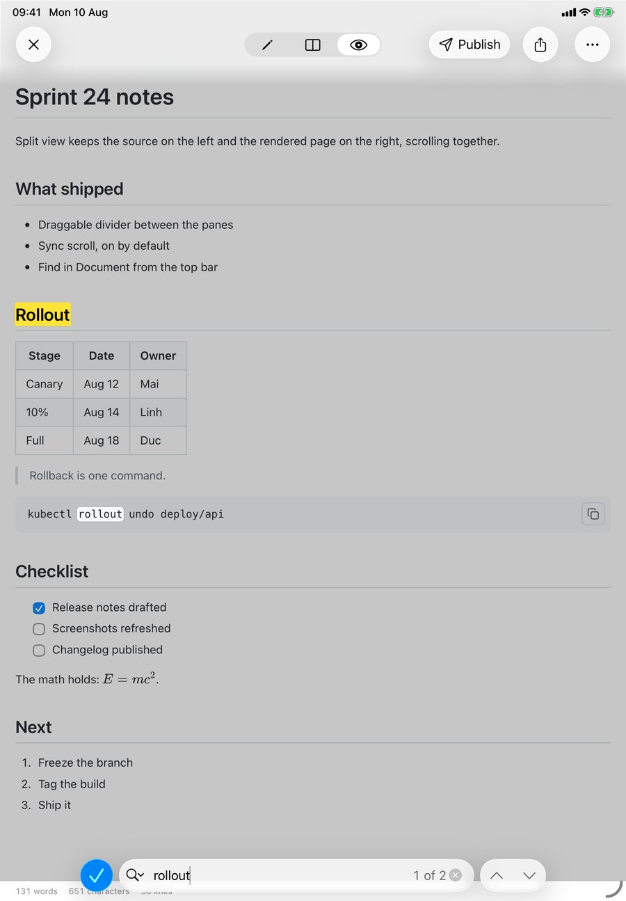
Search lives in the … menu at the top right, as Find in Document. It opens the system find bar at the bottom of the screen with a match counter and up/down arrows, and it is case-insensitive: searching rollout in my test document matched the "Rollout" heading and the kubectl rollout undo line, and reported "1 of 2".
Be aware of one rough edge, since you will hit it the first time you try: Find drops you out of split view into preview-only. The find bar belongs to the preview's web view, and the app switches modes before presenting it even when a preview is already on screen next to your editor. Tap the split icon afterwards to get your two panes back. It is a genuine annoyance and it is on my list.
The formatting bar above the keyboard
Tap into the editor pane and a bar appears above the keyboard with nine Markdown keys: bold, italic, a heading key that cycles H1 to H6, link, bullet list, numbered list, checklist, inline code and quote. They run the same formatting engine as the Format menu on the Mac, so a heading cycled on the iPad and a heading cycled on the Mac produce identical text.
On iPhone that bar also carries a Preview key, because a raised keyboard hides the bottom toolbar there. On iPad it does not need one: the mode picker at the top is never covered.
The full split view, one screen
What the iPad does not get
Being straight about this is more useful than a feature list. Several things in QuickMark are Mac-only, and split view on iPad sits next to their absence:
- No keyboard shortcuts for the view modes. On the Mac, ⌃1, ⌃2 and ⌃3 switch editor, split and preview. On an iPad with a Magic Keyboard there is no equivalent yet: you tap. If you drive an iPad from the keyboard, that will bother you.
- No outline sidebar. Heading navigation is a Mac feature. The iPad shows a heading count in Get Info and nothing more.
- No folder browser and no Quick Look. Both are Mac-only. See pressing Space in Finder for what that looks like over there.
- No auto-reload. The Mac watches the file and picks up edits made in another app; the iPad owns the file while it is open and saves your changes back about half a second after you stop typing.
What the iPad does have alongside split view: all six reading themes, all 36 code themes, over 30 languages of syntax highlighting, five export formats, publishing to a web link, tabs, and printing.
A workflow that fits the tablet
Split view earns its place when you are writing something structured and want to see it settle: release notes with a table, a README with fenced code, meeting notes with a checklist. Write on the left, glance right, keep going. For long-form prose it is often better to go editor-only and switch to preview at the end, since two narrow columns of text are harder to read than one wide one.
Related reading: how to open .md files on iPhone and iPad, and the six reading themes if the rendered pane does not look the way you want it to.
Get rendered Markdown previews everywhere
QuickMark is a free, native Markdown app for Mac, iPhone and iPad. Live preview, export and publish built in.