Markdown Reading Themes: Notion, Docs, Terminal and More
A reading theme decides how your rendered Markdown looks: the typeface, the line length, the colour of a link, whether headings sit above a hairline rule. In QuickMark you pick one in Settings ▸ Appearance ▸ Reading theme, and there are six: Default, Docs, Notion, Essay, Terminal and Minimal. The switch is instant, and it applies to every document you open.
The code theme is a separate setting sitting right below it, and it only colours fenced code blocks. Two knobs, two jobs. This post shows all six reading themes on the same document, explains what each one actually changes, and points out one entry in the code-theme list that currently does nothing.
Where the setting lives
On Mac: QuickMark ▸ Settings… (⌘,) ▸ the Appearance tab. Reading theme is under the "Document Style" heading, with the app's own one-line description of the selected theme underneath it.
On iPhone and iPad: the gear button, then the Appearance section at the top. Same list, same order.
Above both pickers sits Appearance: System / Light / Dark, which is a different axis. Light and dark decide the palette; the reading theme decides the typography and layout, and most themes adapt to whichever palette you are in. Terminal is the exception, and I will come back to it.
The six themes, same document
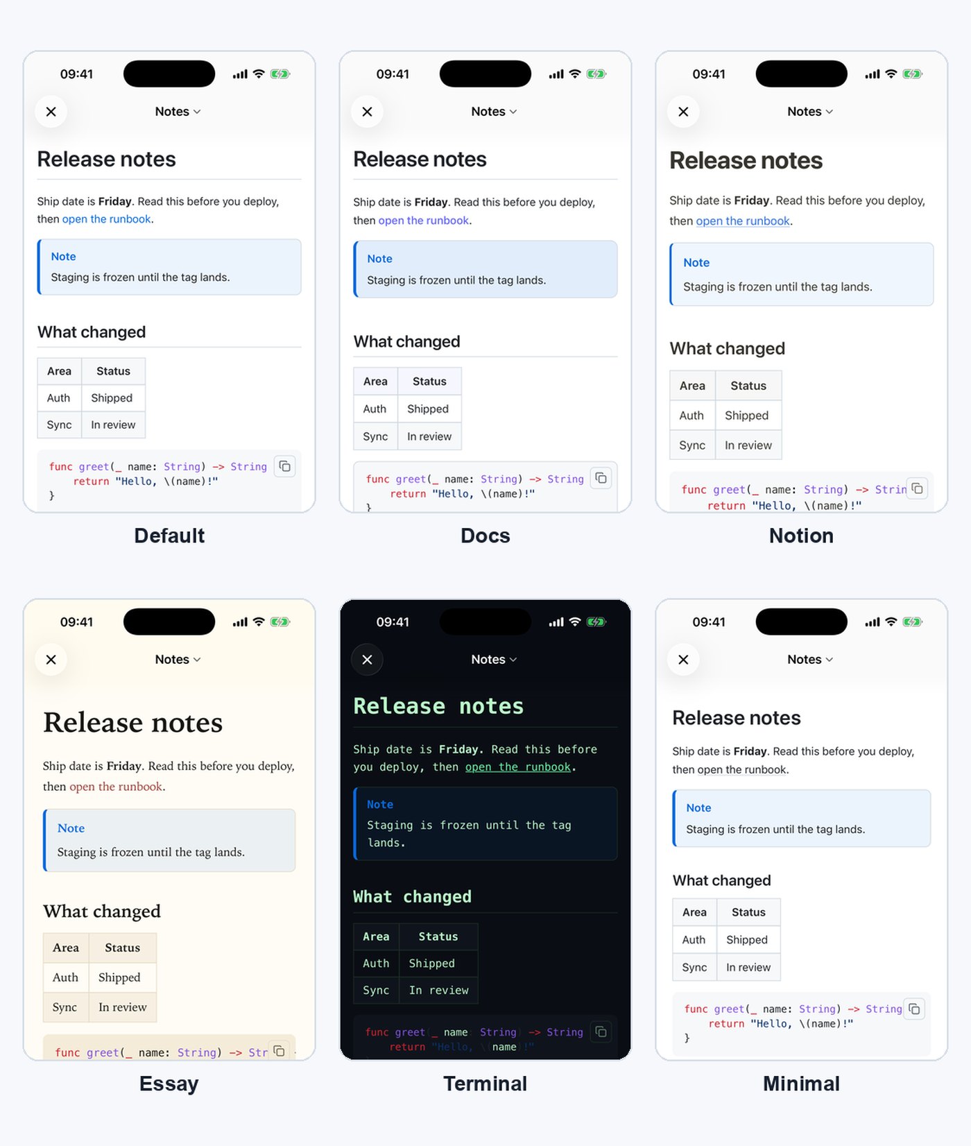
Default is the GitHub-flavoured look you already know: system sans, a hairline rule under H1 and H2, blue links. If you spend your day in pull requests, this is the one that will not surprise you.
Docs is the documentation-site look. Sans typeface, indigo links, code blocks and inline code get a real border instead of just a grey fill, callouts become rounded cards with a thicker accent bar, and table headers pick up a faint tint of the link colour. It is the theme to pick when the document is going to be read as reference material.
Notion softens everything. Bigger, heavier H1 at 2.1em, no rules under headings, warm near-black body text instead of pure black, pastel callouts, gentle table headers. Line height goes to 1.75, so the page breathes more than Default does.
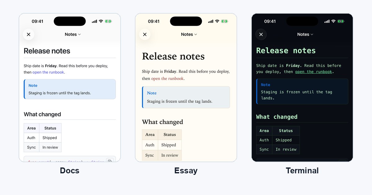
Essay is the biggest departure. A serif stack (Iowan Old Style, then Palatino, then Georgia), line height 1.78, and the text column narrows to 46rem and centres itself so lines stay short enough to read comfortably. In light mode it swaps the whole palette for warm paper: a cream background, brick-red links, and the code surfaces warmed to match so they do not sit on the page like a cold grey patch. Block quotes go italic. Headings lose their rules.
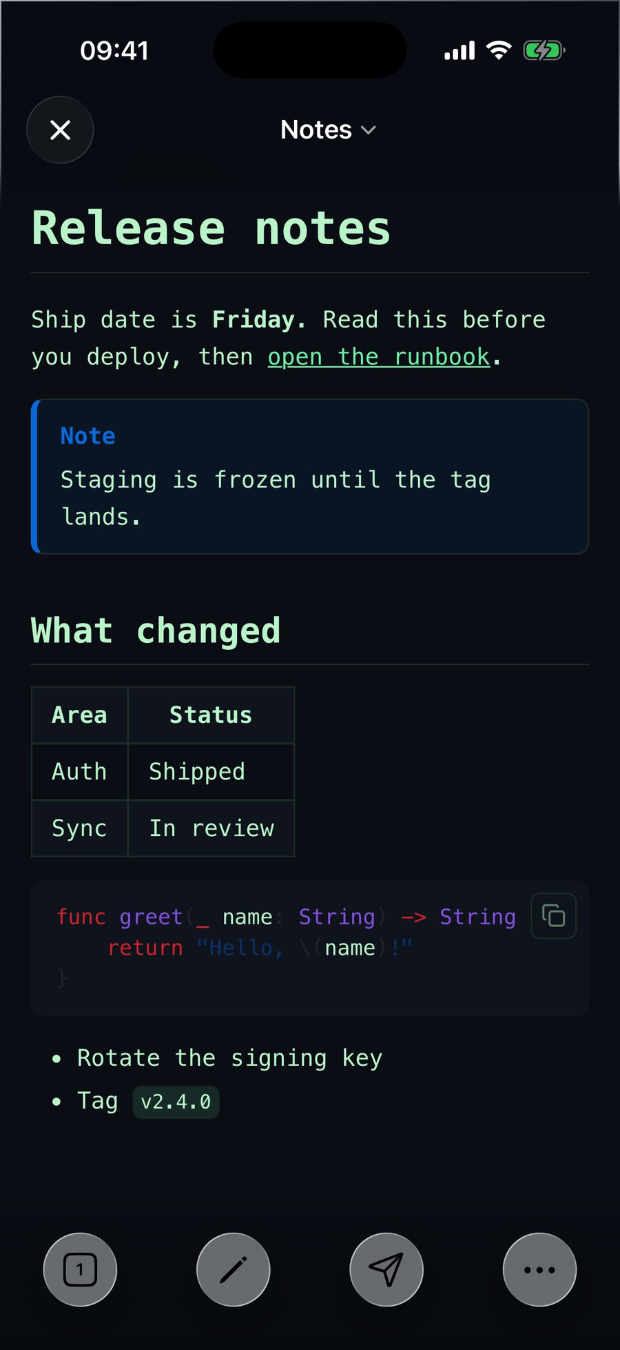
Terminal is monospace, always dark, phosphor green. It is the only theme that overrides your Light/Dark choice: pick Terminal while your Mac is in Light mode and the preview still comes out dark, because its background is nailed to a fixed value rather than following the light/dark switch.
Minimal takes things away rather than adding them. A 44rem column, no heading rules, smaller headings (H1 drops to 1.85em), and links rendered in the same colour as the body text with a faint underline instead of blue. Look at the Minimal tile above: "open the runbook" is a link, and you can tell only by the underline. That is deliberate. In a document full of references, blue everywhere is noise.
Two of them repaint the app around the text
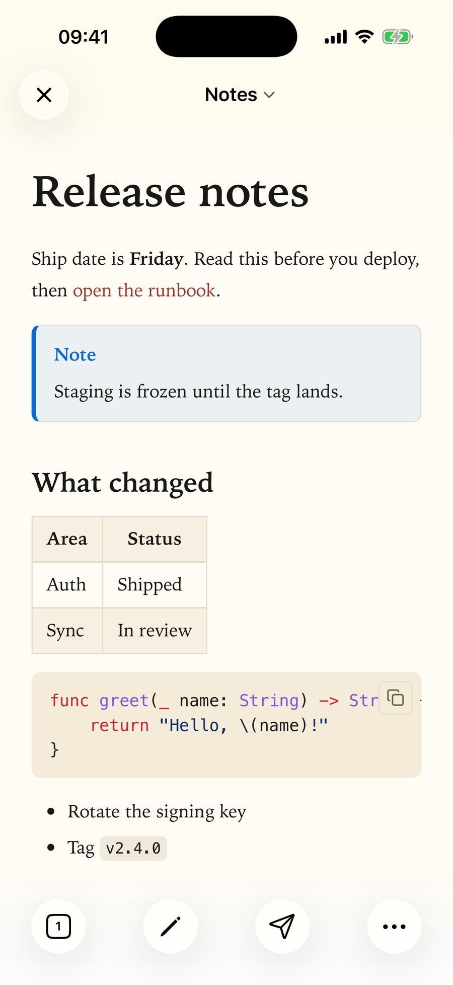
This is the detail I did not expect to find in the source. Terminal and Essay do not stop at the rendered page. The editor pane, the gutter and the window chrome get repainted to the theme's exact background colour, so in split view the source side and the preview side are the same shade of paper or the same shade of black. The other four leave the editor white in light mode.
You can see it in the two full screenshots below: the status bar area, the document title bar and the bottom toolbar all follow the theme, not the system.
Switching is free
Changing reading theme does not re-render your document and does not touch the network. The renderer sets a single attribute on the page and the stylesheet does the rest, which is why the change lands the instant you release the picker, even on a long file.
Code themes work slightly differently: each one is a small stylesheet that ships inside the app, and switching swaps which one is attached. Still local, still no network, just a file swap instead of an attribute flip.
Code themes: 36 to choose from
The code-theme picker opens with Default, a GitHub-like palette that reads well in both Light and Dark. Below it sits a Recommended group of ten: Dracula, One Dark, Nord, Solarized Dark Atom, Material Oceanic, GitHub Colors, Atom Dark, Gruvbox Dark, Night Owl and One Light. Then All themes, twenty-six more in alphabetical order. Thirty-six named themes in total.
That is more than anyone needs, and the excess is the point. Most developers already have a palette they have been staring at for years in their editor, and the odds are good it is somewhere in that list. Pick it once, forget the setting exists.

Reading theme and code theme are separate settings, which matters more than it sounds. Essay with Dracula is a perfectly sensible combination: warm serif prose, dark code. Nothing stops you pairing them however you like.
One preference, every document
The reading theme is a single app-wide setting, not a per-file one. There is no way to say "this document is an Essay and that one is a Terminal". If you switch to Essay to read something long, everything you open next is also Essay until you switch back.
Whether that is right depends on how you work. It keeps the setting where you expect it and out of your files, and it means nothing about your Markdown changes when you pick a theme: the file on disk stays exactly the characters you typed. But if you want per-document styling, this is not it.
Where the theme follows your document out of the app
The reading theme is not only a screen preference. It travels into some of what QuickMark produces:
- Publish to Web. A page you publish starts from your current reading theme, and the reader can change it on their end from the display panel.
- PNG export. Exporting as an image keeps the reading theme, so a Terminal document exports as a dark image.
- Printing. Worth knowing before you hit ⌘P: printing inherits the reading theme too, and a dark theme prints badly. Switch to a light theme first.
Which one to pick
If you are reading something long, Essay. If the document is reference material other people will use, Docs. If you write in Notion all day and want the preview to stop feeling foreign, Notion. If your document is mostly code and mostly read at night, Terminal. If headings and blue links feel loud, Minimal. If none of that applies, leave it on Default.
Then set the code theme once and forget it. It has no effect on anything except the colours inside fenced blocks, which you can see for yourself in code blocks with syntax highlighting.
Get rendered Markdown previews everywhere
QuickMark is a free, native Markdown app for Mac, iPhone and iPad. Live preview, export and publish built in.